


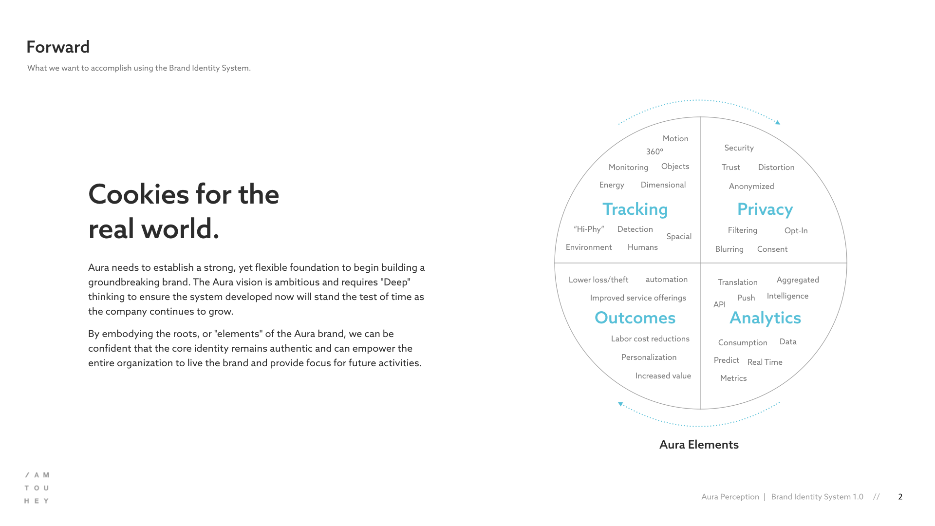
Cookies for the Real World
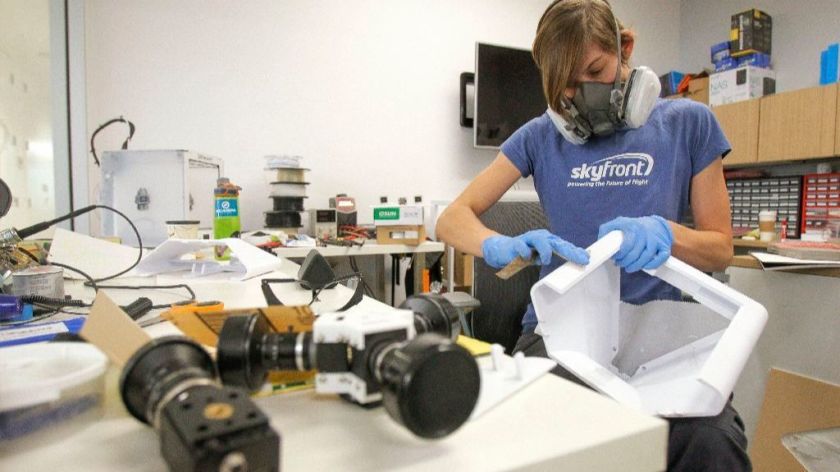
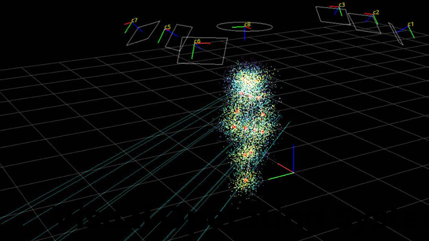
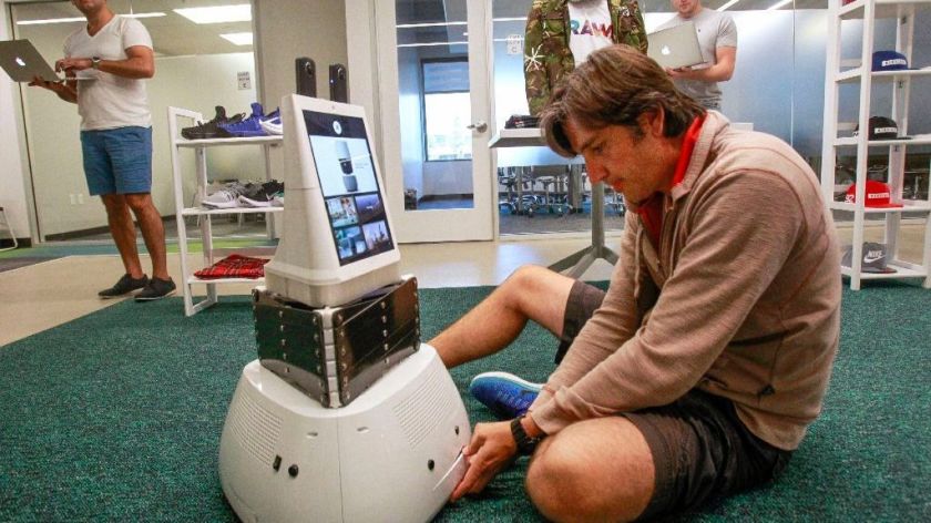
Venture-backed startup Accel Robotics is helping lead the future of retail with a cashierless vision-based automated shopping system (think Amazon Go) that allows consumers to skip the line and “grab and go.” Using a mix of artificial intelligence (AI), neuroscience, and computer vision, Accel has developed a breakthrough 360º visual operating system that enables machines to see and understand the real world in three primary forms: people, products, and actions.
The founders of Accel came to me to create a new brand “vision” for their core technology named the Aura Perception Engine. We discussed that “Aura” could replace the parent brand in the future or possibly be spun-off into a separate entity, so the best strategy would be to treat this as an identity that could stand on its own and not constrain any design based on current assets.
As with most early-stage companies, the key objectives were focused primarily on creating core assets that would be used to create awareness with investors and attract talent. But, along with the standard brand applications, the identity would also need to extend and adapt to hardware (e.g., smart shelves, camera mounts, etc.) and a myriad of physical retail environments.
Project Role
Creative Direction
Identity
Visual Design
Wireframing
Copywriting
Cookies for the Real World
The discovery phase was crucial for this project. Gaining a deep comprehension of the technology, the business model, target market, and its users helped inform the next steps. A shared understanding was accomplished by:
- 1:1 stakeholder interviews with the founders (CEO, CMO)
- Onsite technology demos in the “market lab”
- Competitive research
- Desktop research (learning more about AI, Deep Learning, etc.)
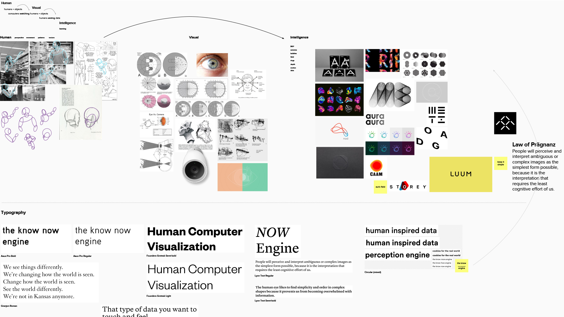
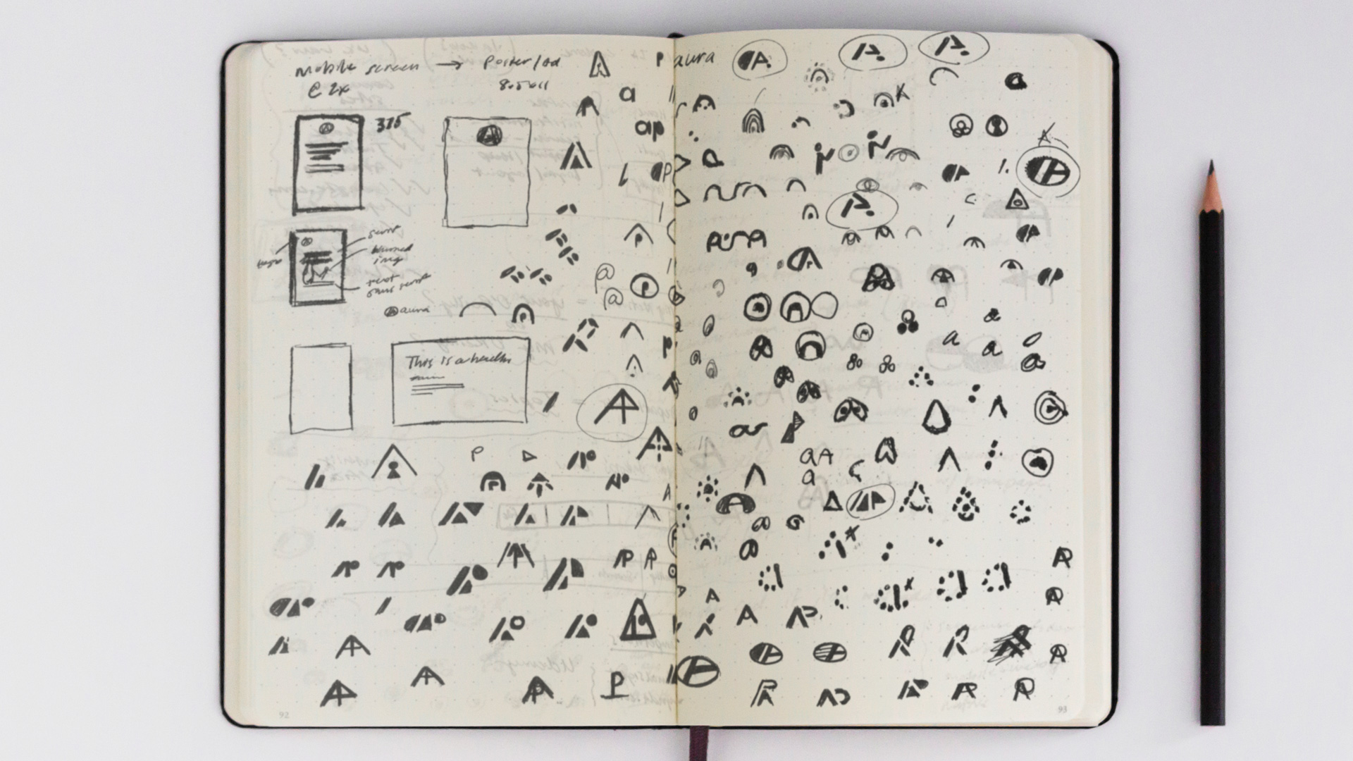
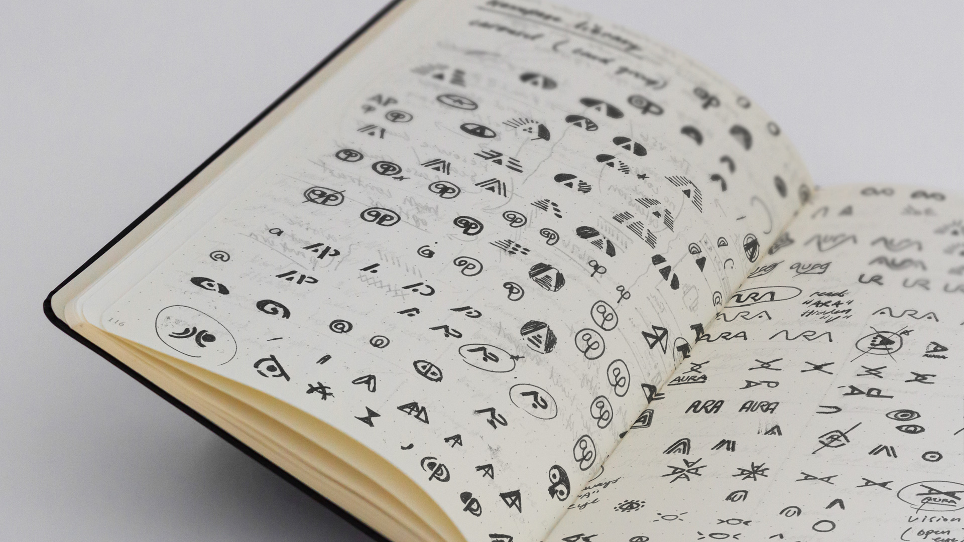
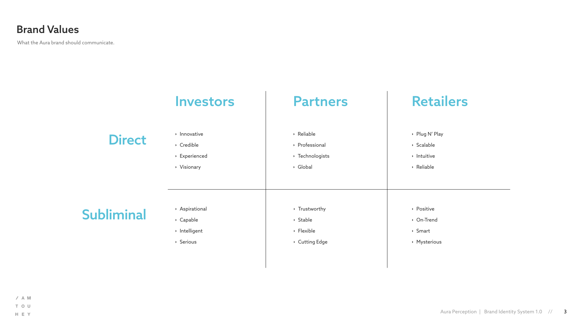
After feeling more comfortable in the space, I created mood boards and a lite journey map to align stakeholders with the high-level direction. Once we reached alignment, I produced multiple rounds of hand sketches and mid-fidelity logo concepts to begin capturing the essence exhibited. The team then selected from two hi-fidelity options along with typography and color recommendations.
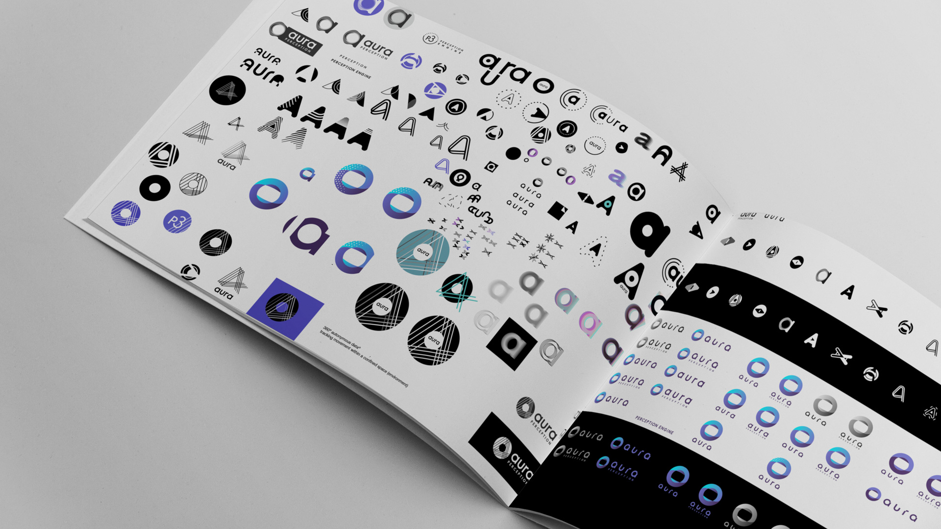
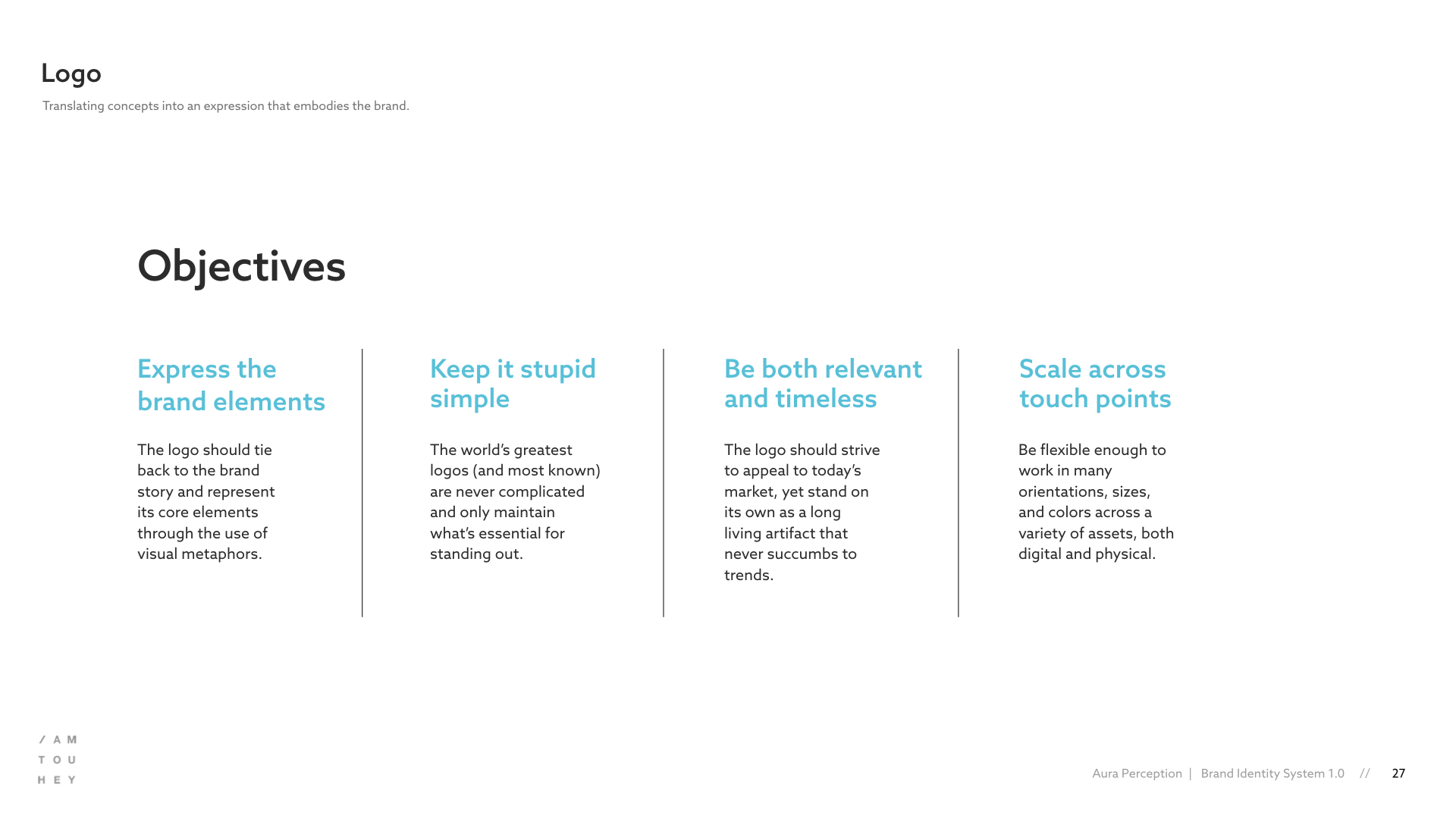
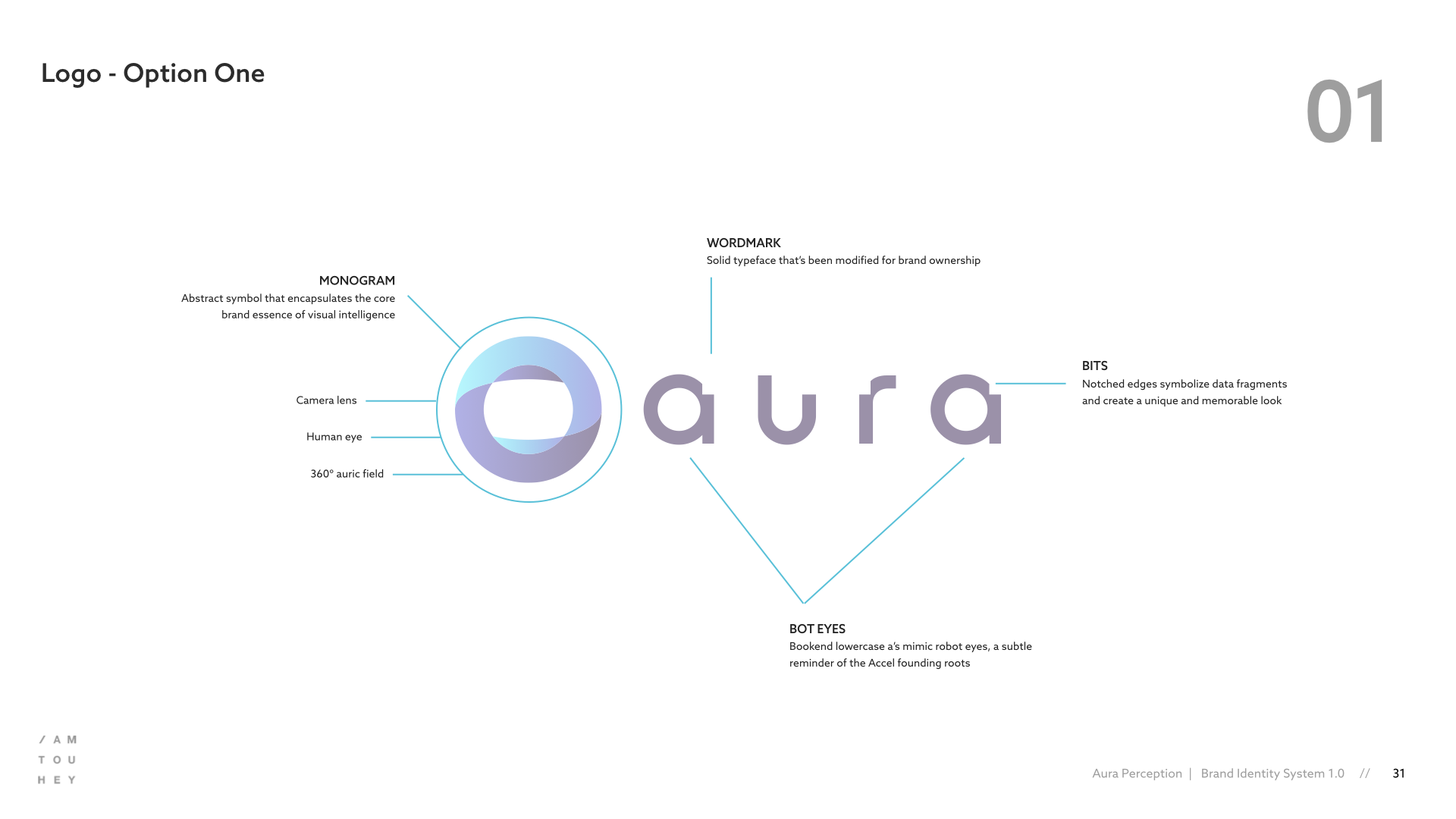
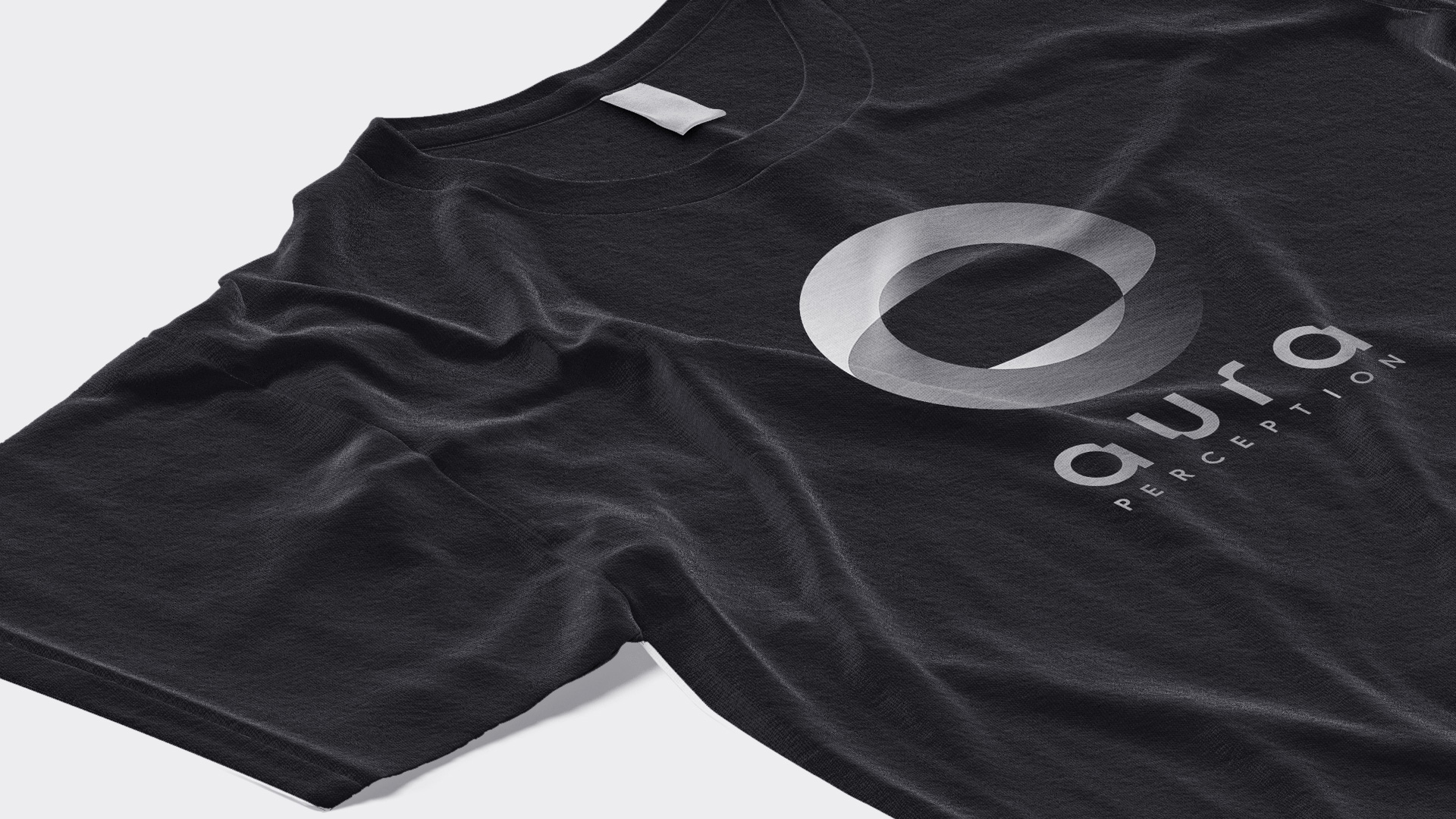
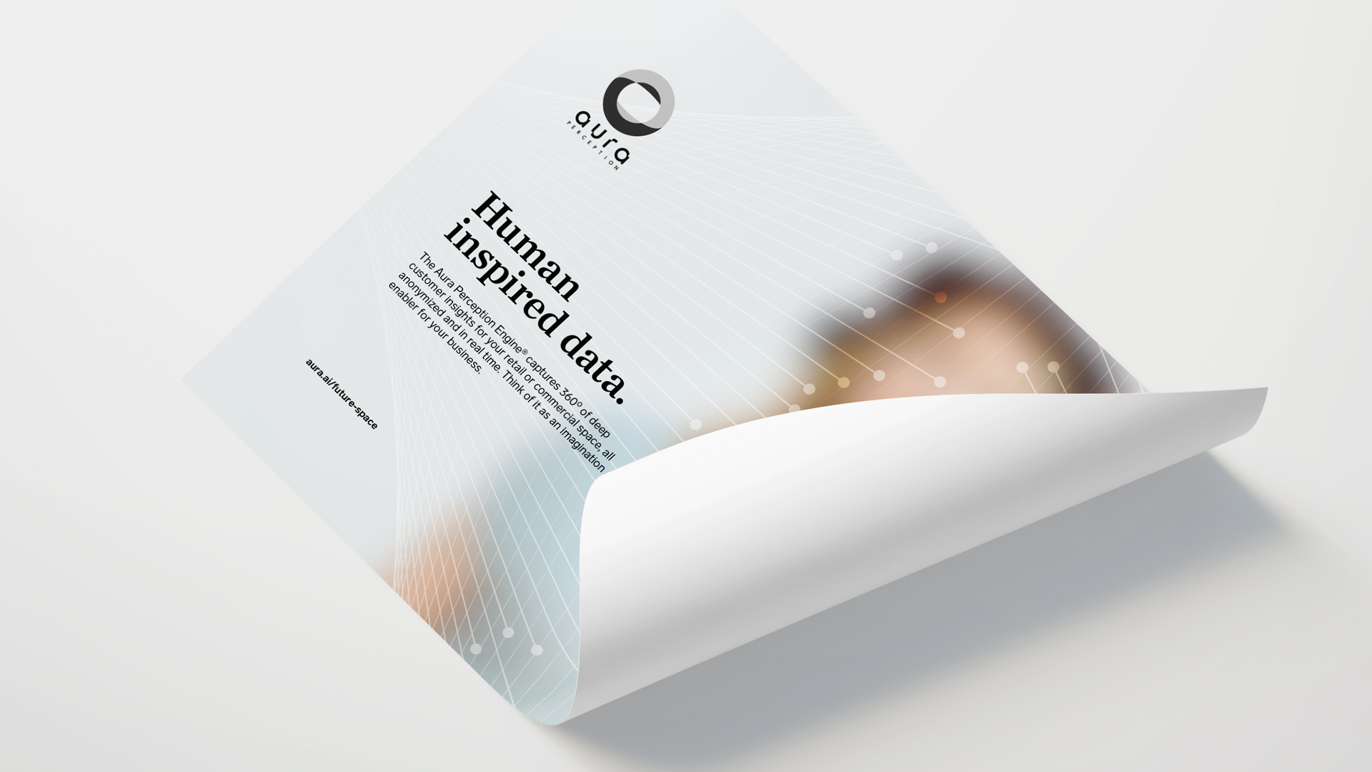
The selected mark consists of a monogram and wordmark combination that encapsulate the Aura technology while also giving the nod to the companies roots in robotics. The monogram stands as a symbol for visual intelligence, mimicking a camera lens, the human eye, and a 360ª auric field. The wordmark is notched to communicate the flow of data being captured and anonymized along with a subtle easter egg of robot eyes formed by the bookend lowercase letter a’s.
Thinking Systemically
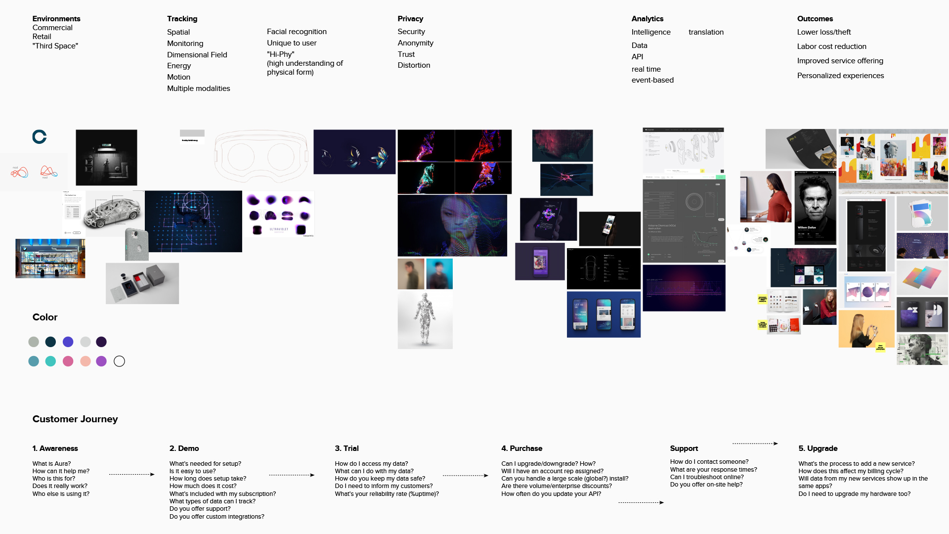
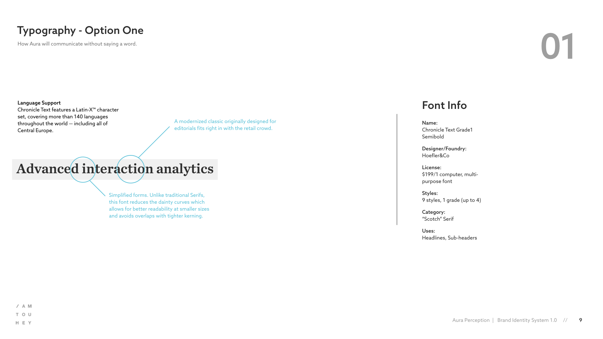
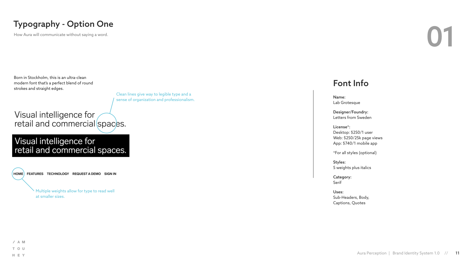
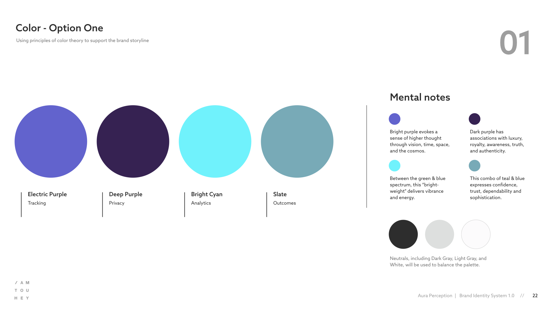
During the logo development phase, I worked in a parallel track to define the Aura visual language. Referencing the mood boards and the preliminary identity concepts, I began to explore a range of visual styles across multiple touchpoints. Iterating back & forth between different types of applications ultimately surfaced a common brand expression.
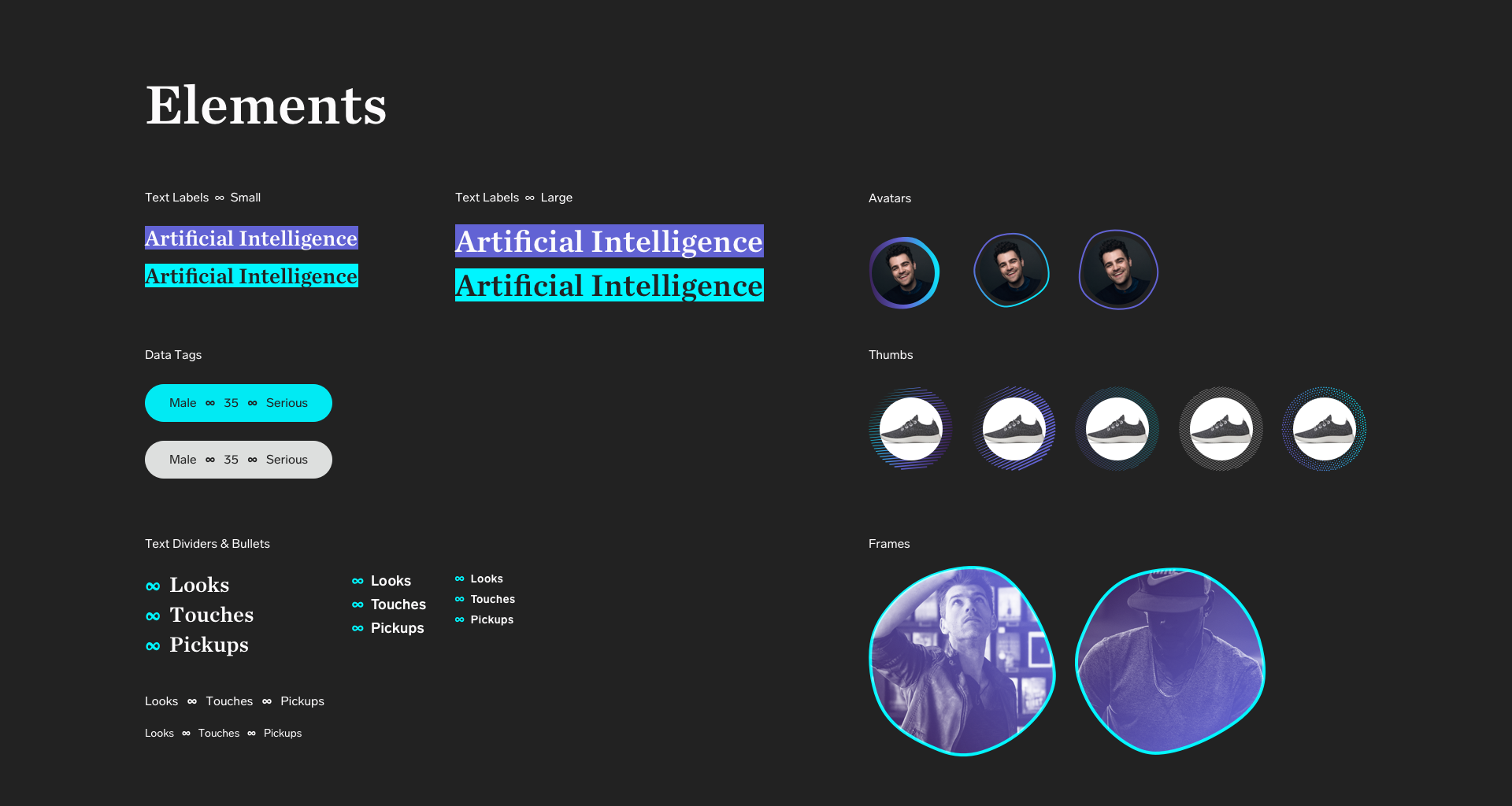
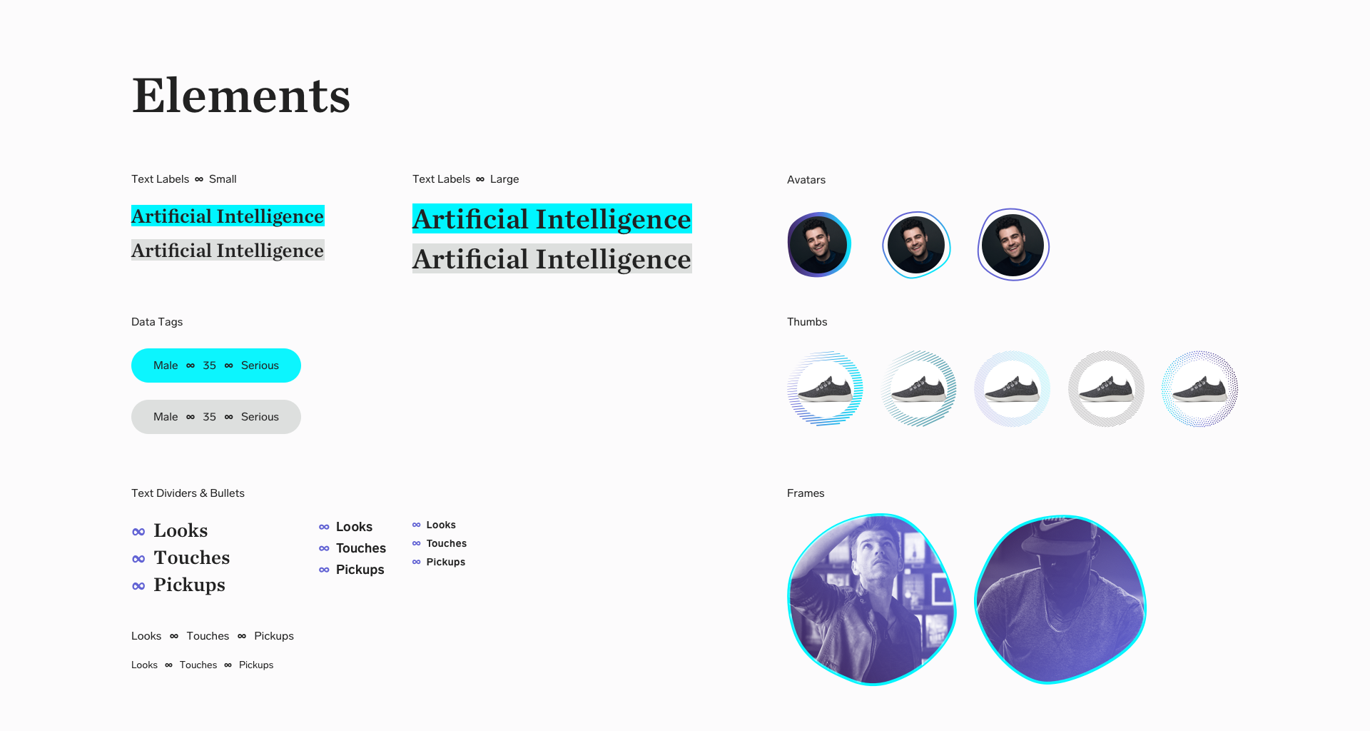
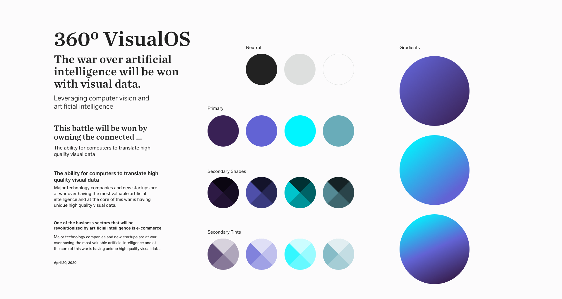
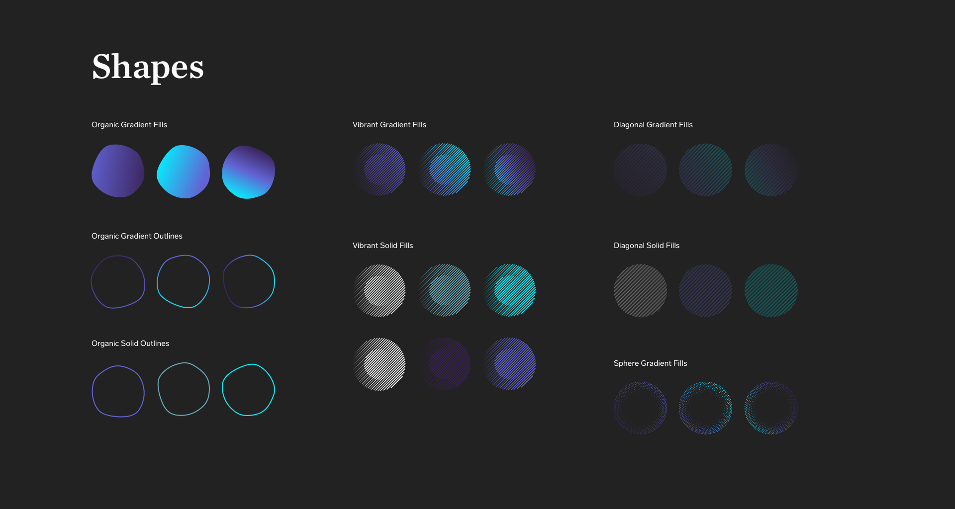
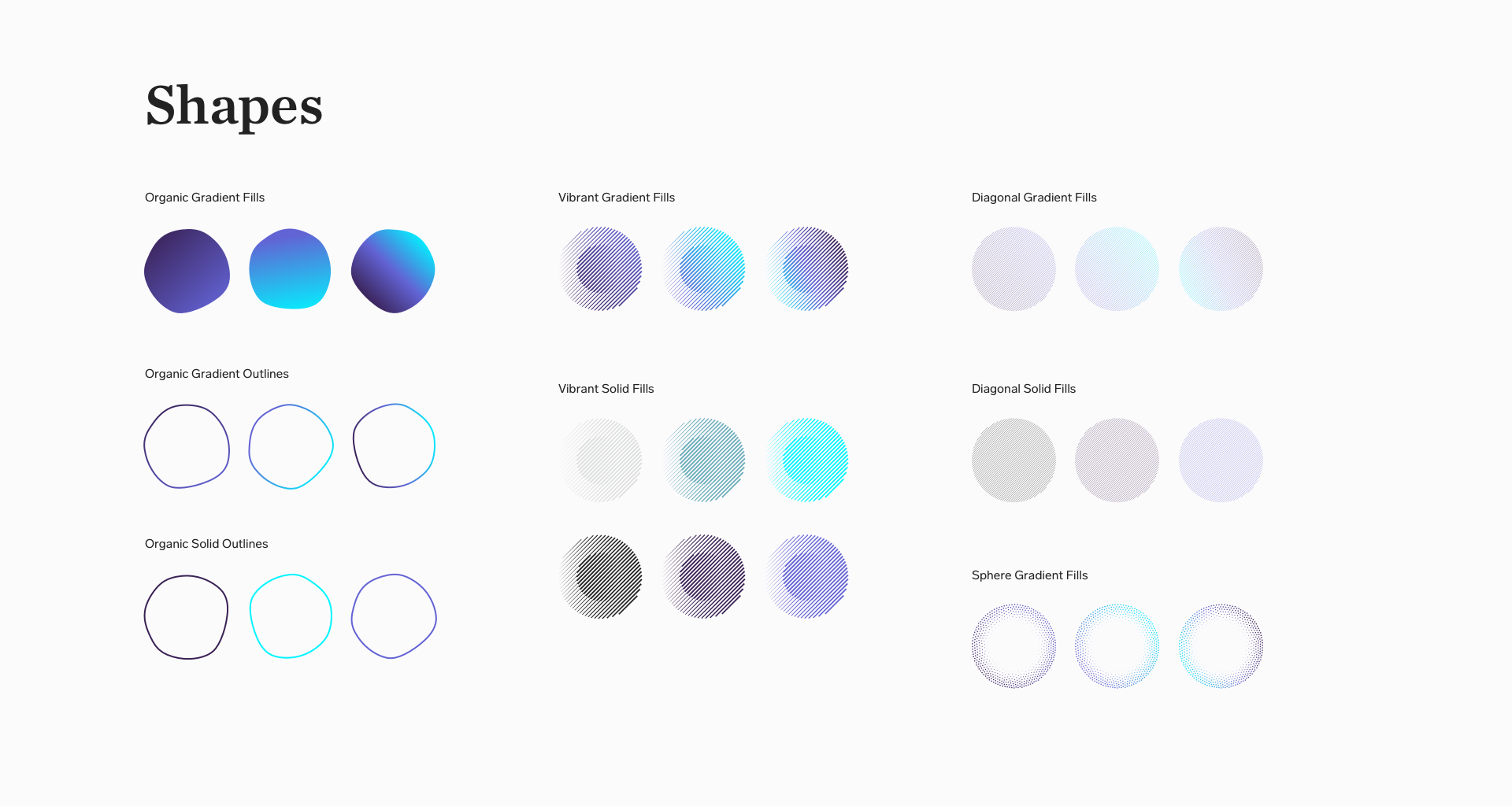
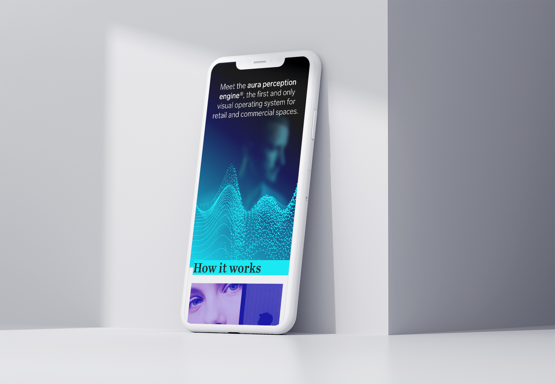
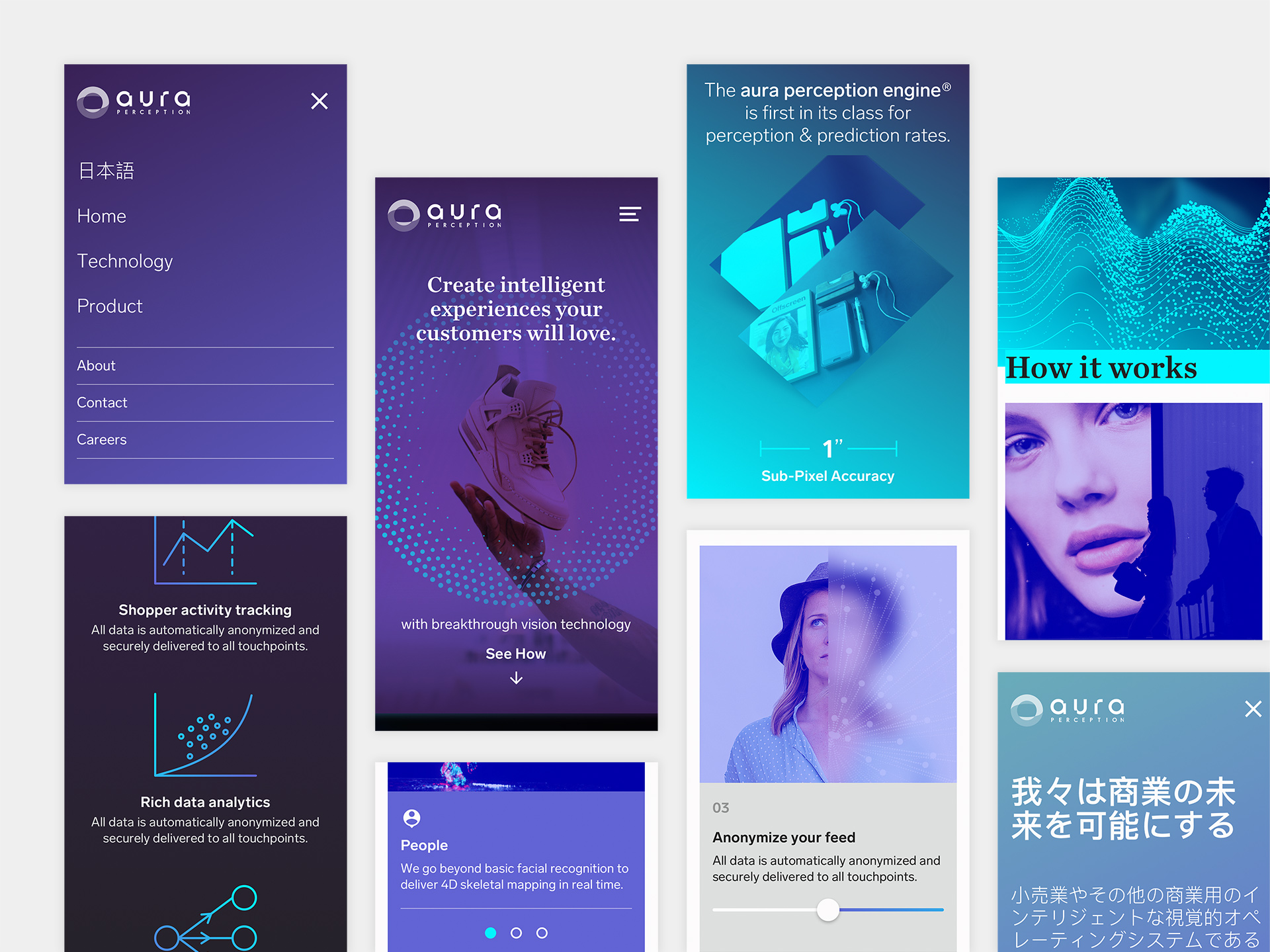
As patterns emerged throughout adapting the visual styles, I began to gather and organize them into what became the core of the Aura design system. A conscious effort was made to develop a baseline system early-on to support the future design and implementation of the company website and consumer mobile applications.
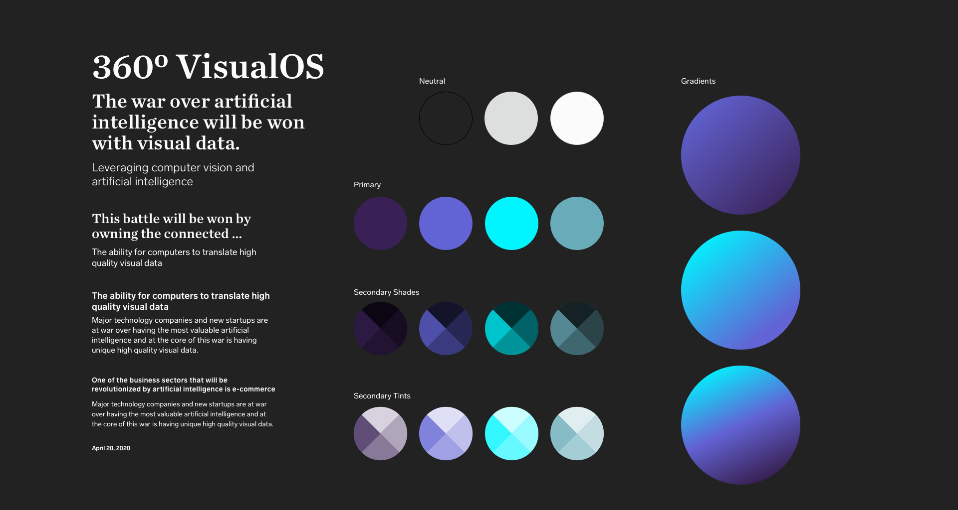
The result was a mix of typographic styles, a refined palette, and a series of atomic elements presented in both dark and light themes.
Seeing is Believing
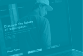
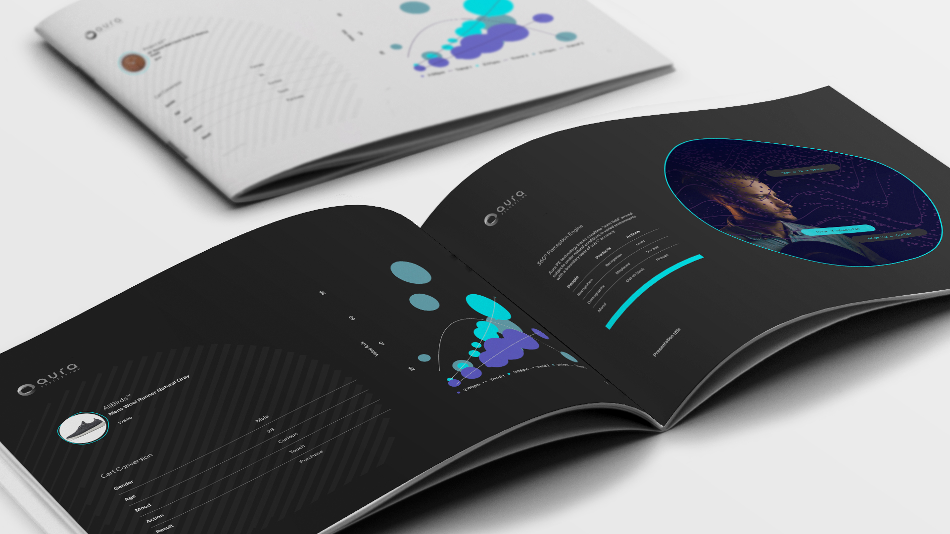
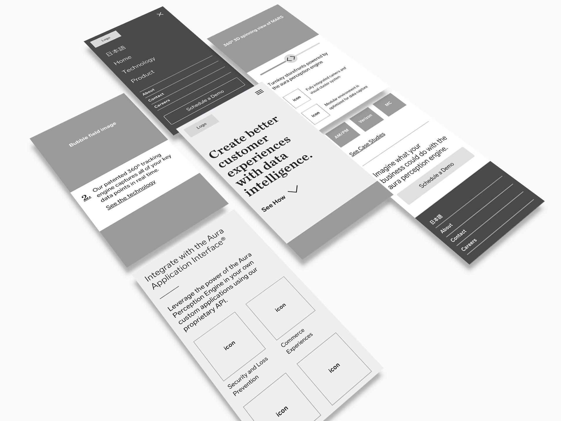
Accel was relying heavily on telling their product vision through slide decks but wanted a different medium to tell their brand story. I created a sitemap and lo-fidelity wireframes to gain alignment on the target audience (Investors and future employees) and how to best present the Aura technology. I also authored a separate text-only copy deck and shared it with the founders so we could collaborate on the language and hone the Aura brand voice together. The design system was then leveraged to bring the wireframes to life, packaged in a clickable prototype for review and feedback from the broader team.
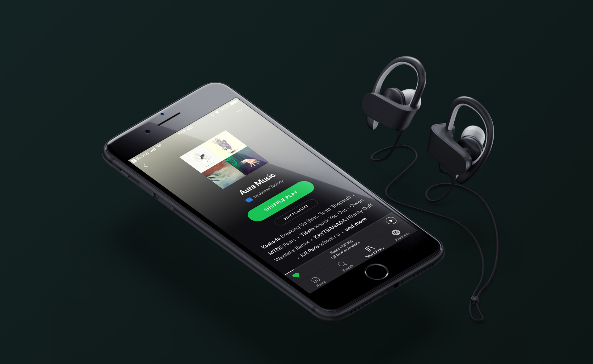
The Aura Sound
To complete the Aura brand experience, I curated a custom Spotify playlist with songs (and sounds) that evoke the essence of the technology. It seemed fitting to provide some auditory balance for a product that is so dependent on its visual capabilities (cameras, sensors, etc.). The music also serves as a unifying element for team members to “feel” the brand they’re working so hard to build.