Bringing Water Back to Life
Aquam Technologies is a biotech startup that offers a fantastic patented solution that turns toxic wastewater into clean water for crop irrigation and other non-drinking uses. The process can be done in as little as four hours and is packaged to run independently from significant wastewater treatment plants; which allows for more straightforward global distribution. The RoddenBerry foundation (creator of Star Trek) and many other angel investors back the startup.
I engaged with Aquam for a few months to help solve several challenges they were facing. 1) The company had research grants that were expiring soon, and we're looking to raise additional funding. 2) Aquam had been showcased in several startup events but was still lacking in brand awareness within their space. 3) The founders were struggling with how to tell their brand story in a compelling way that made sense to both investors and scientific partners.


Project Role
Creative Direction
Brand Strategy
Identity
Visual Design
Copywriting


Field Research
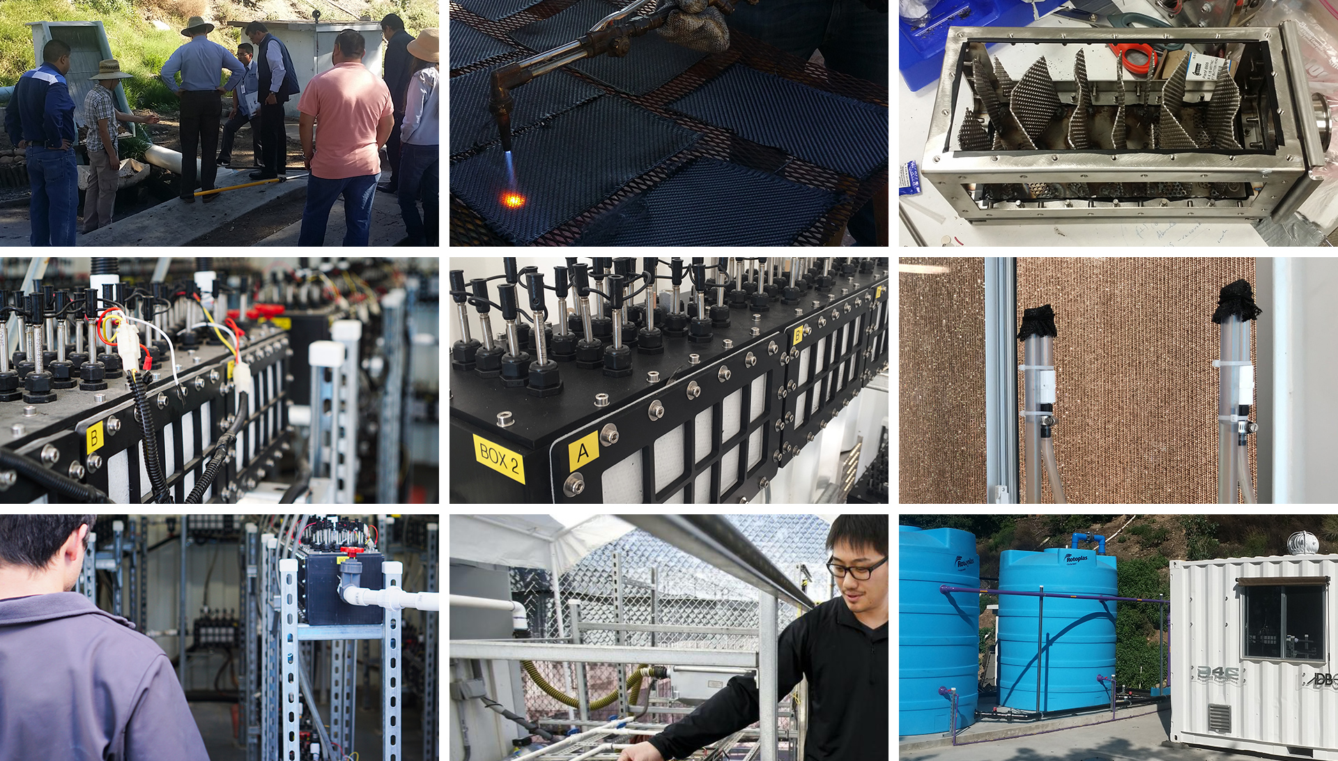
Before jumping into solutions for the brand direction I did some preliminary discovery work, including:
- 1x1 stakeholder interviews with the founders (CEO, CTO)
- Hands-on tour of the Aquam laboratory and technology center
- Competitive research
- Desktop research
I wanted to truly understand the market space and the underlying technology that Aquam had developed in an effort to establish a storyline balance that both non-technical investors and savvy scientific partners could understand and relate to.

Nature Meets Tech
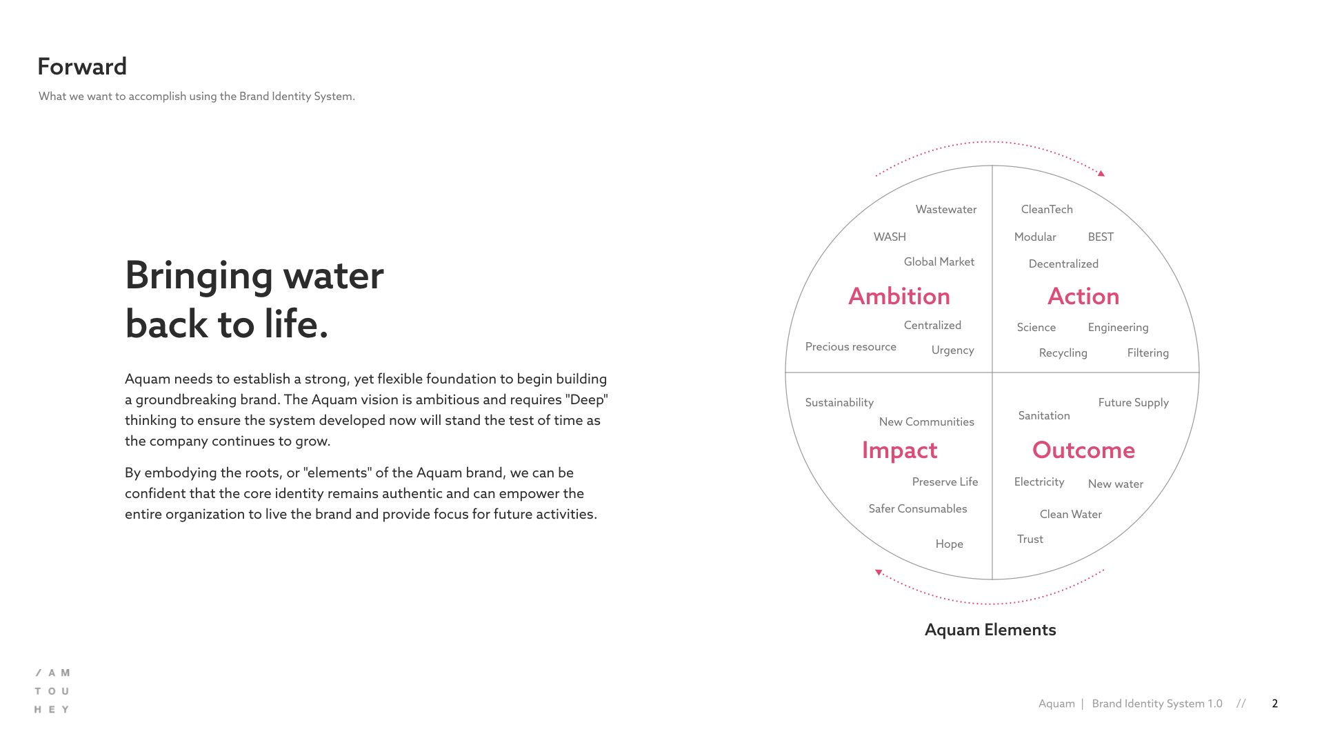
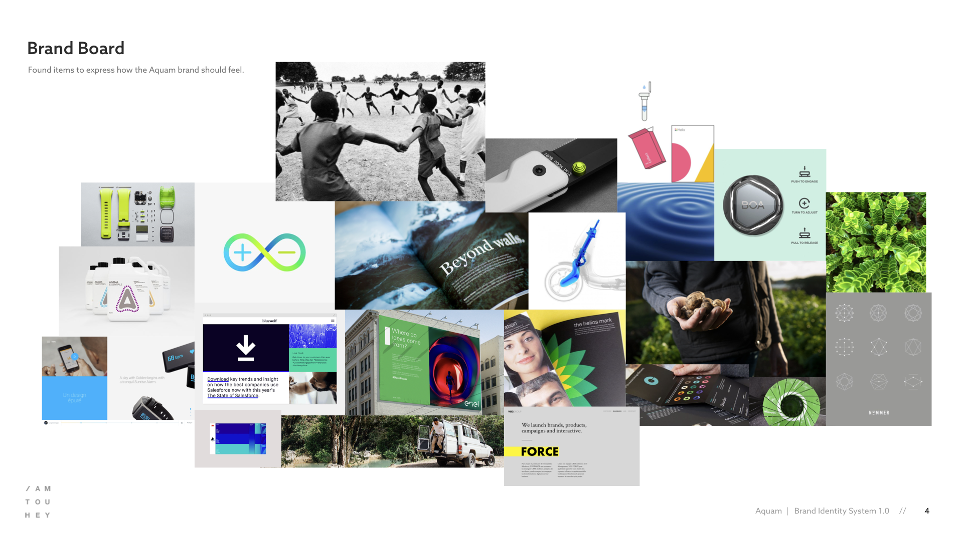
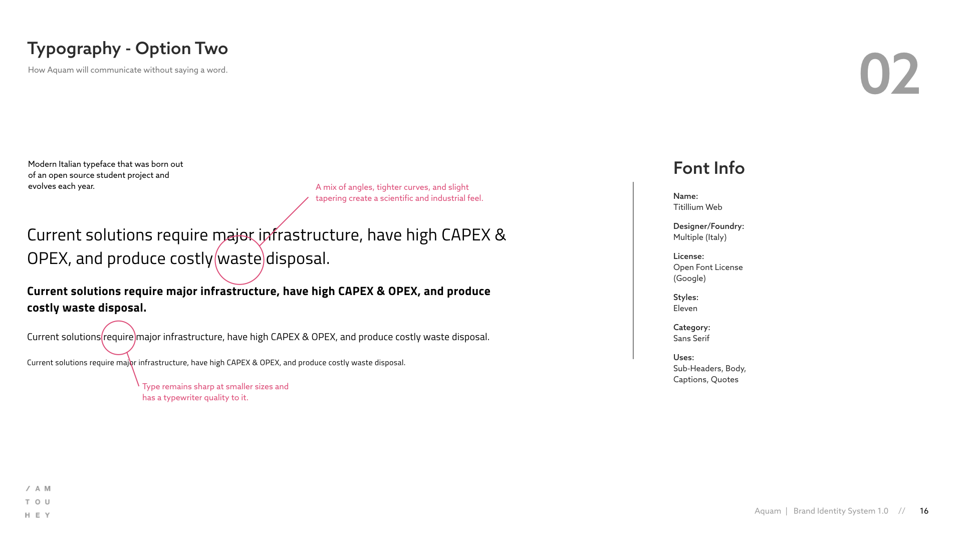
After completing the initial research and discovery phase, I began approaching the identity, starting with an essence wheel and mood board to align & define the overall brand concept. The high-level direction of the brand expression was a modern sense of science and tech blended with community and nature.
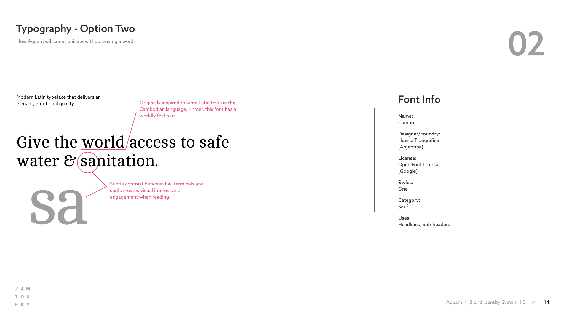
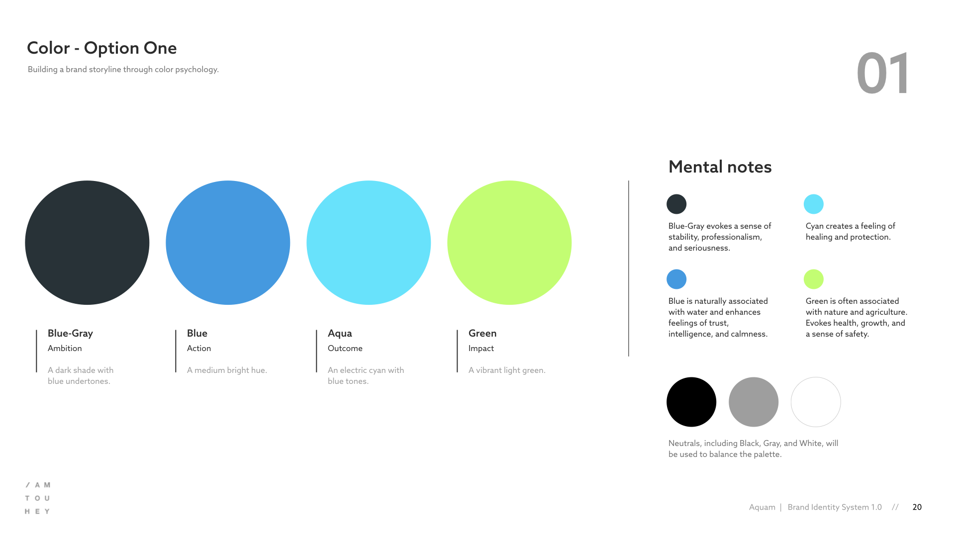
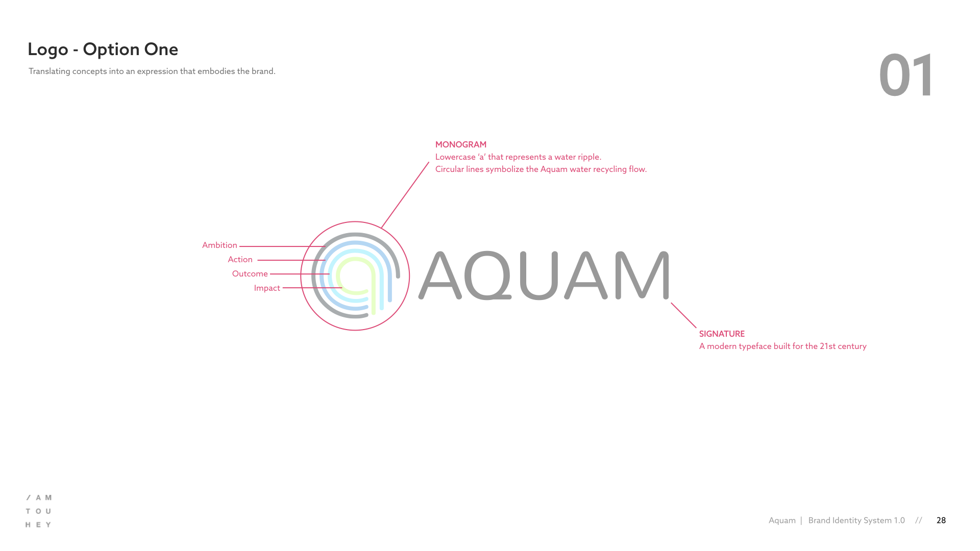
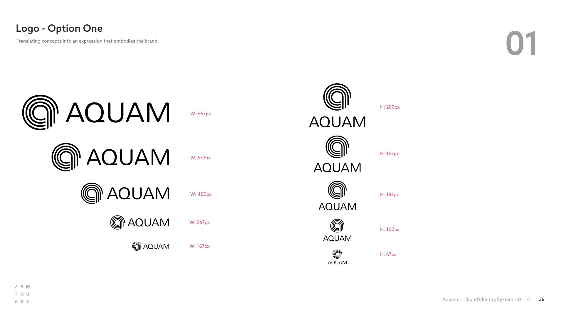
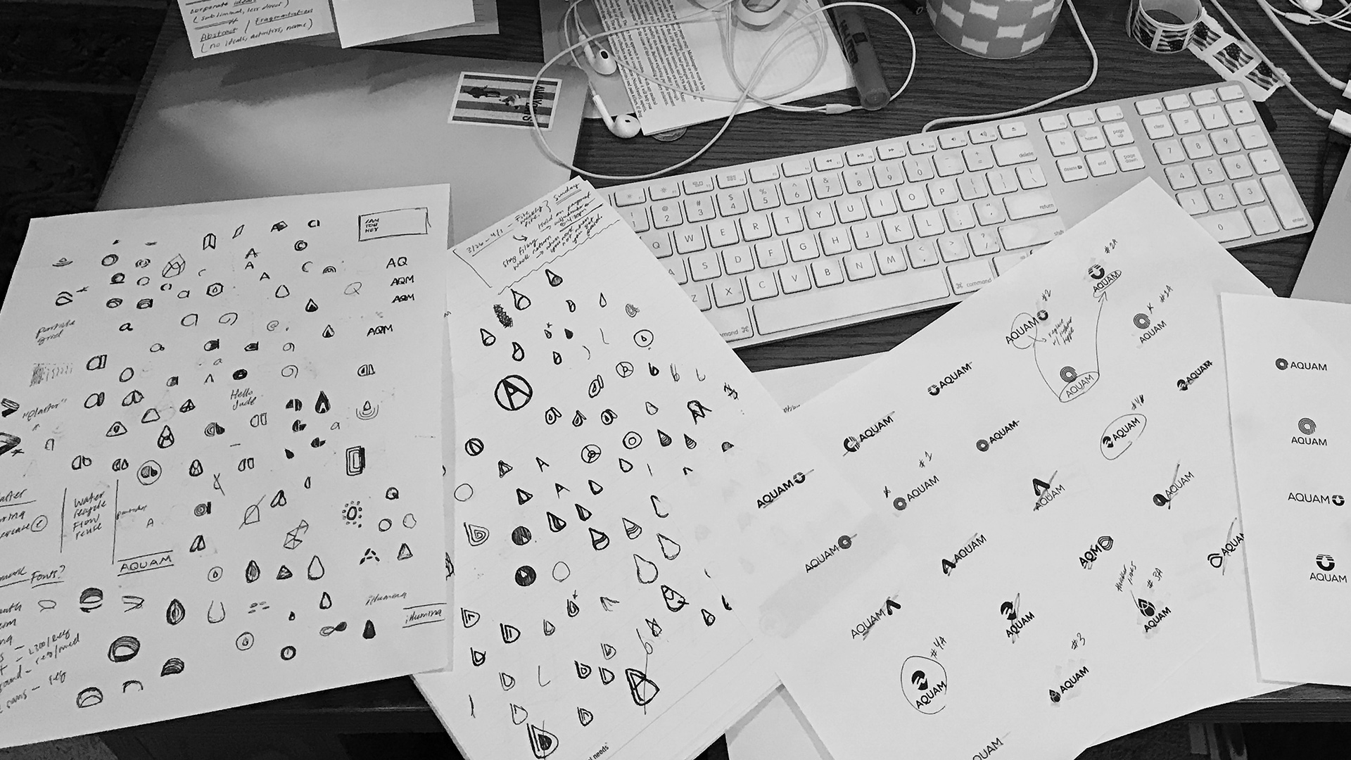
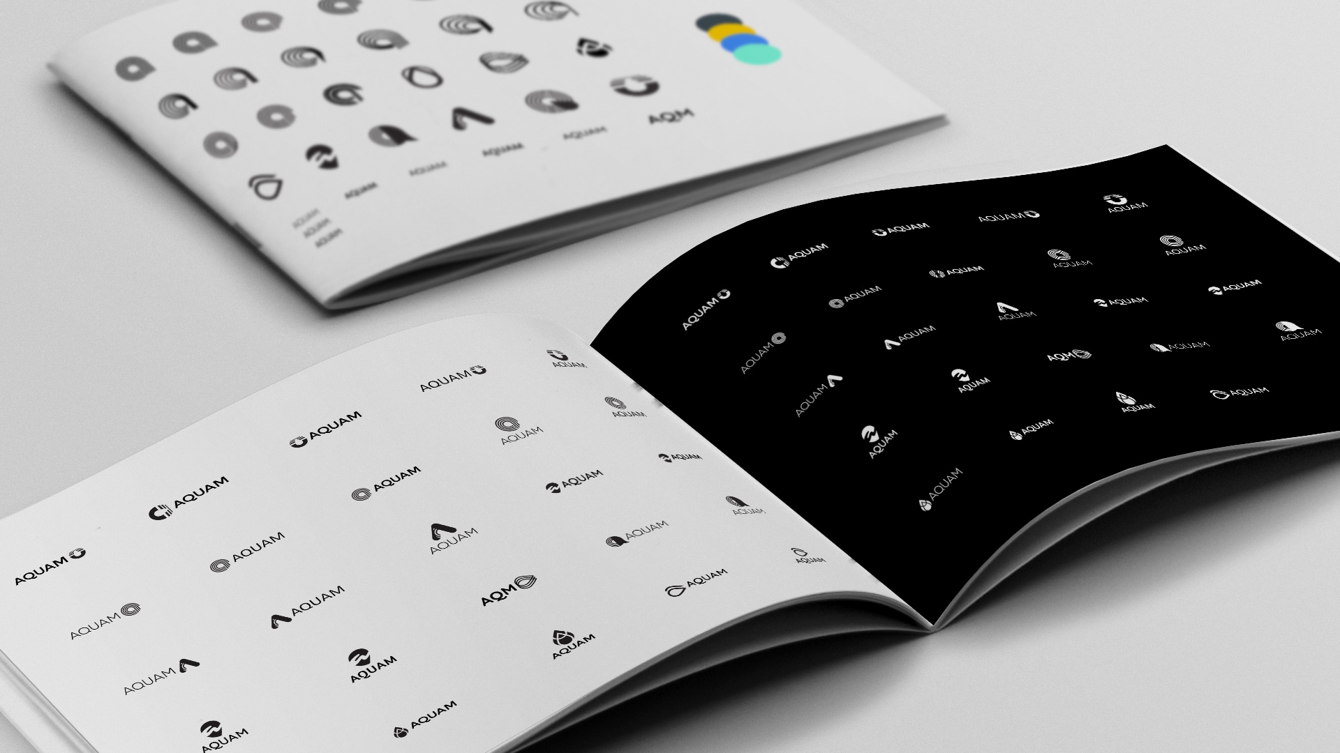
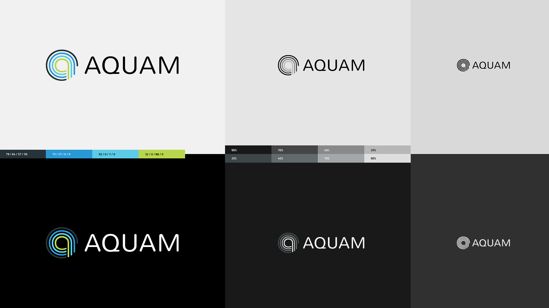
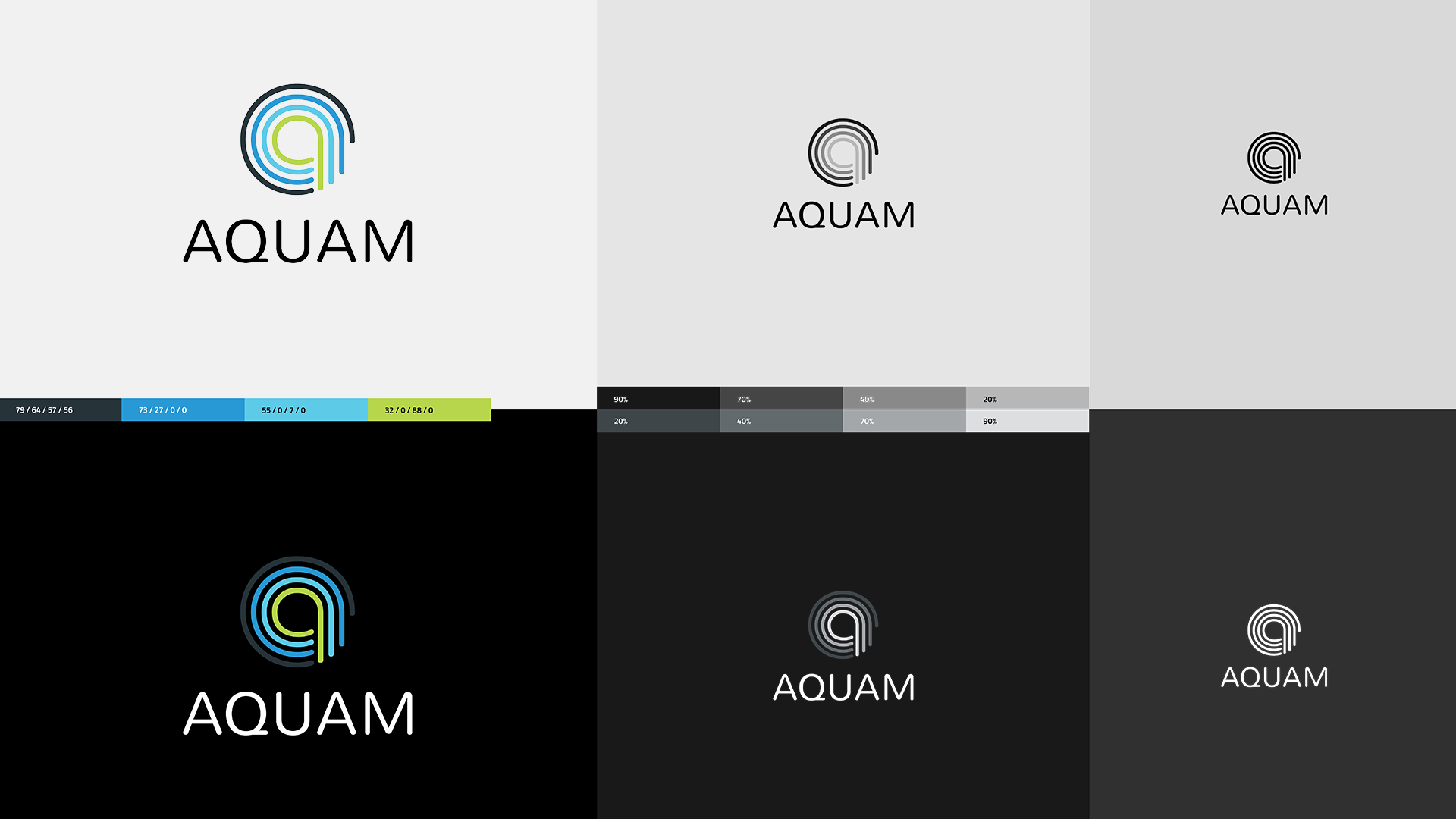
From there I moved into first identity explorations consisting of color palettes and typography pairings. In parallel, I sketched endless low-fidelity concepts of the logo by hand until something was strong enough to begin working into the black & white mid-fidelity range. I presented three options to the client with the final selection being a “water ripple” monogram and signature paired with a bold and vibrant palette.
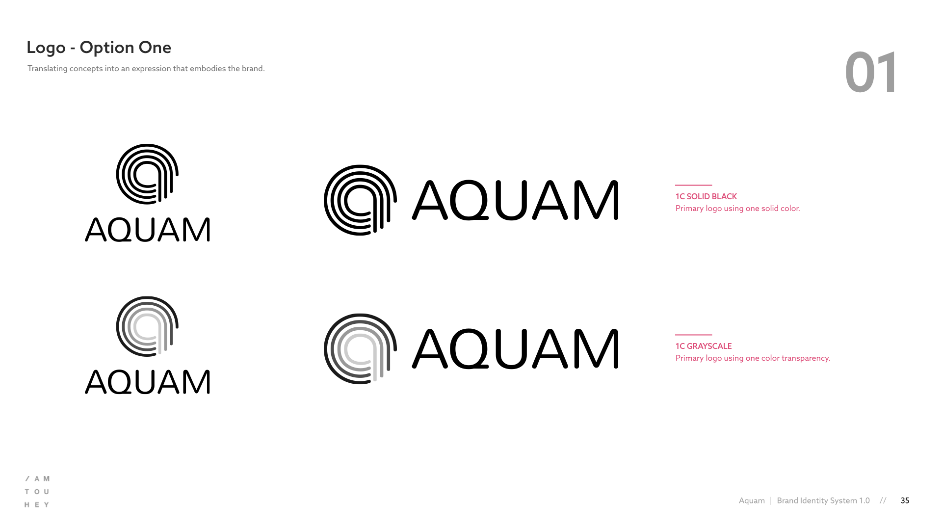
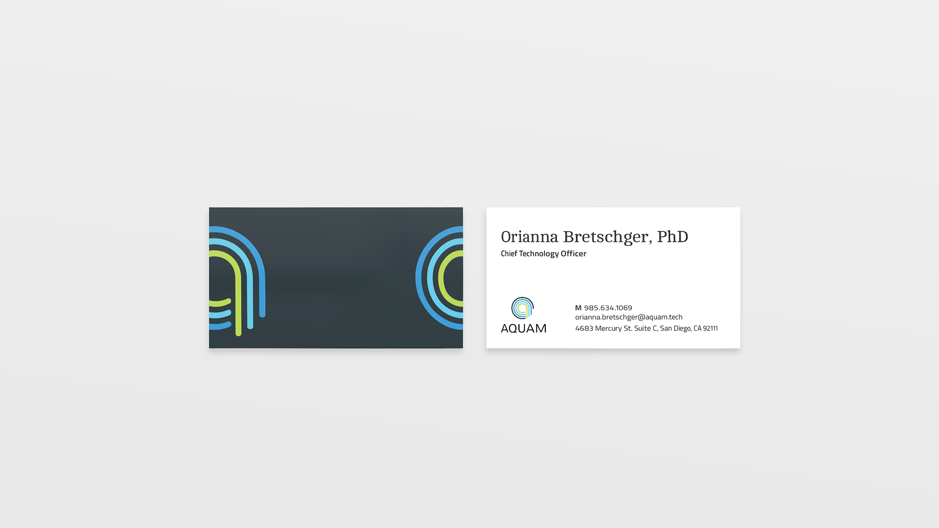
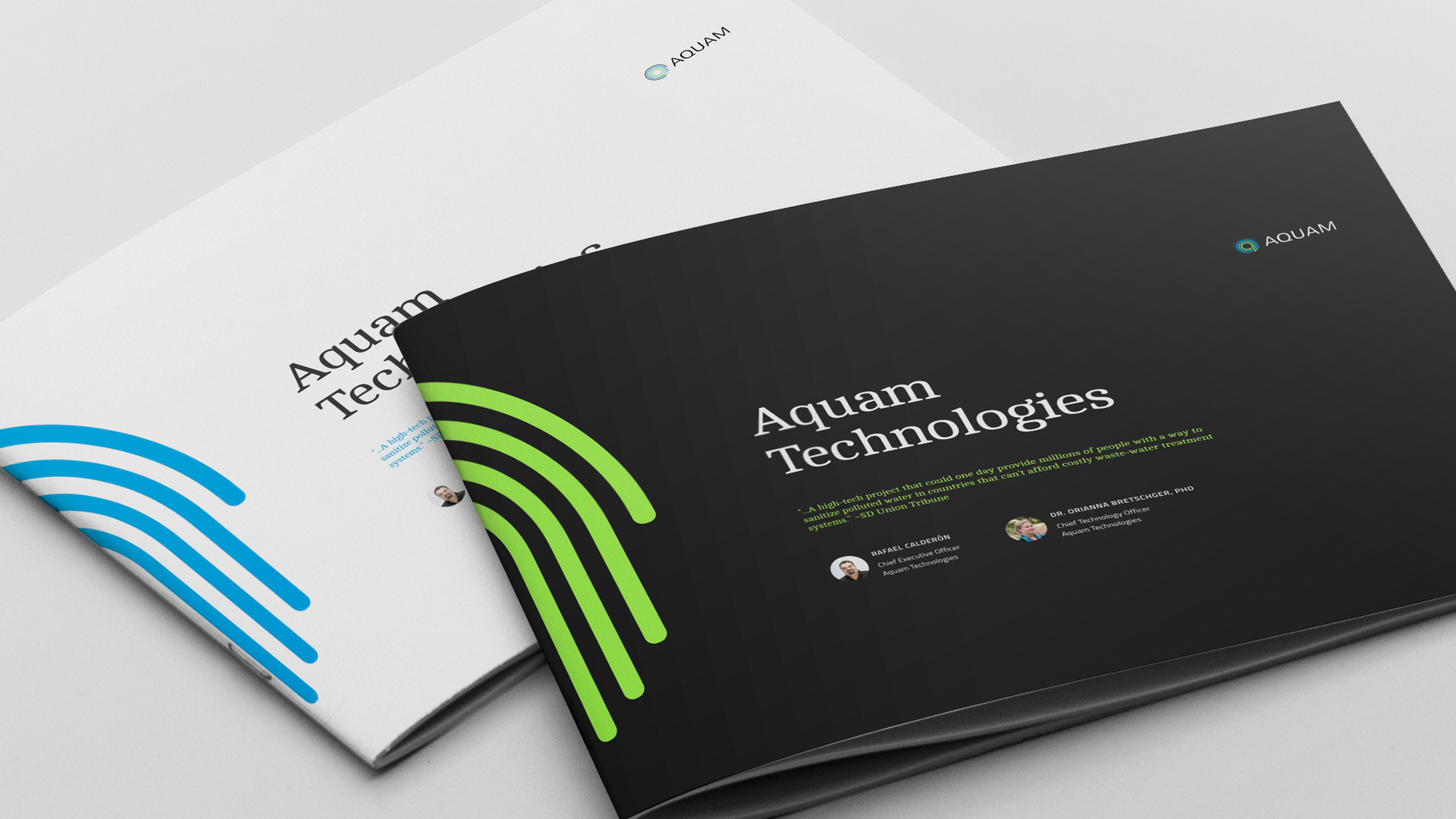
I developed both a horizontal and vertical orientation and stress tested for scalability and adaptability to multiple touch points. I also explored additional extensions of the mark while producing a series of business cards and later an investor pitch deck.






Making it Clear
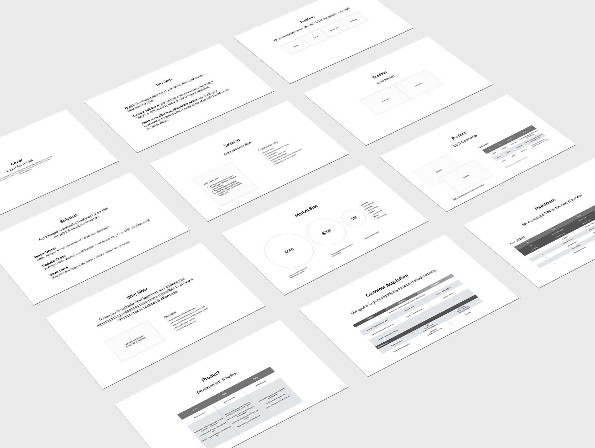
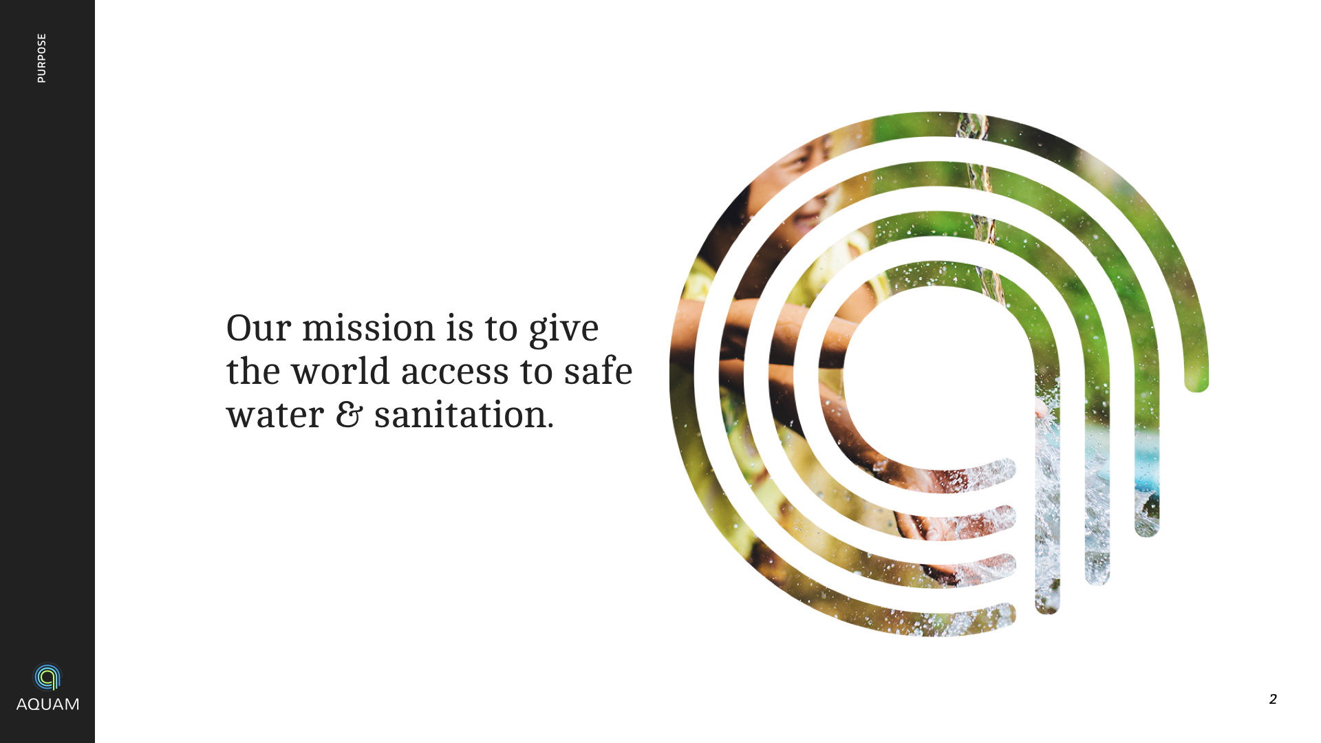
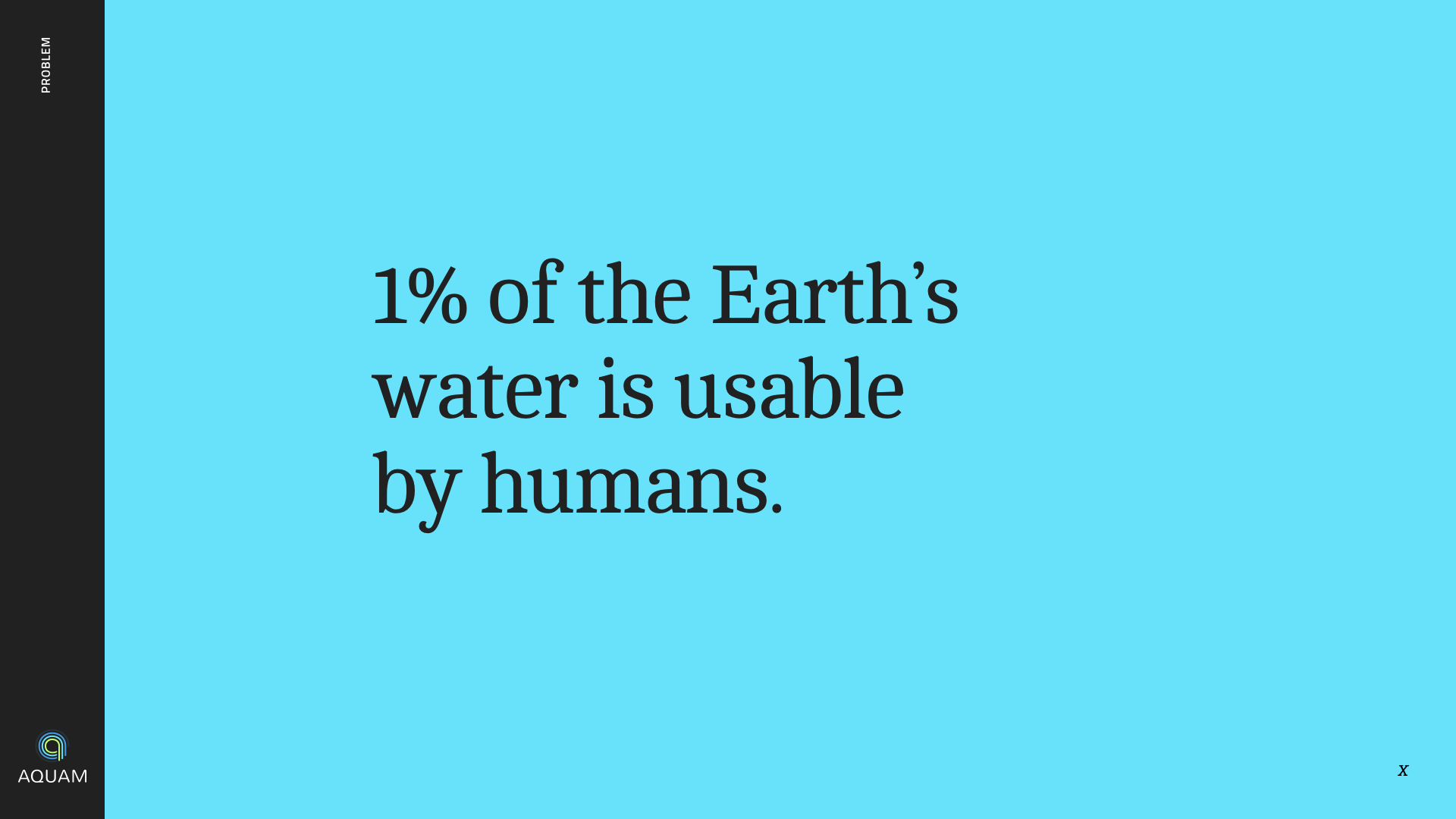
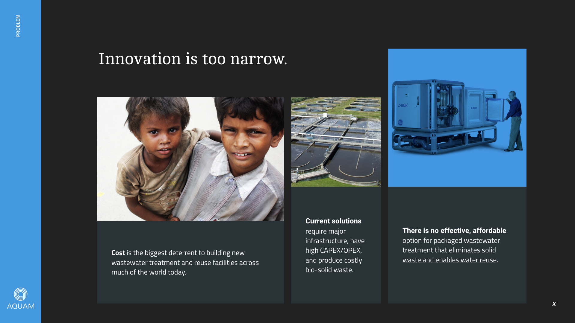
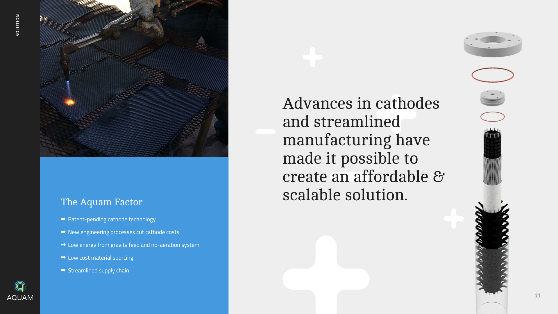
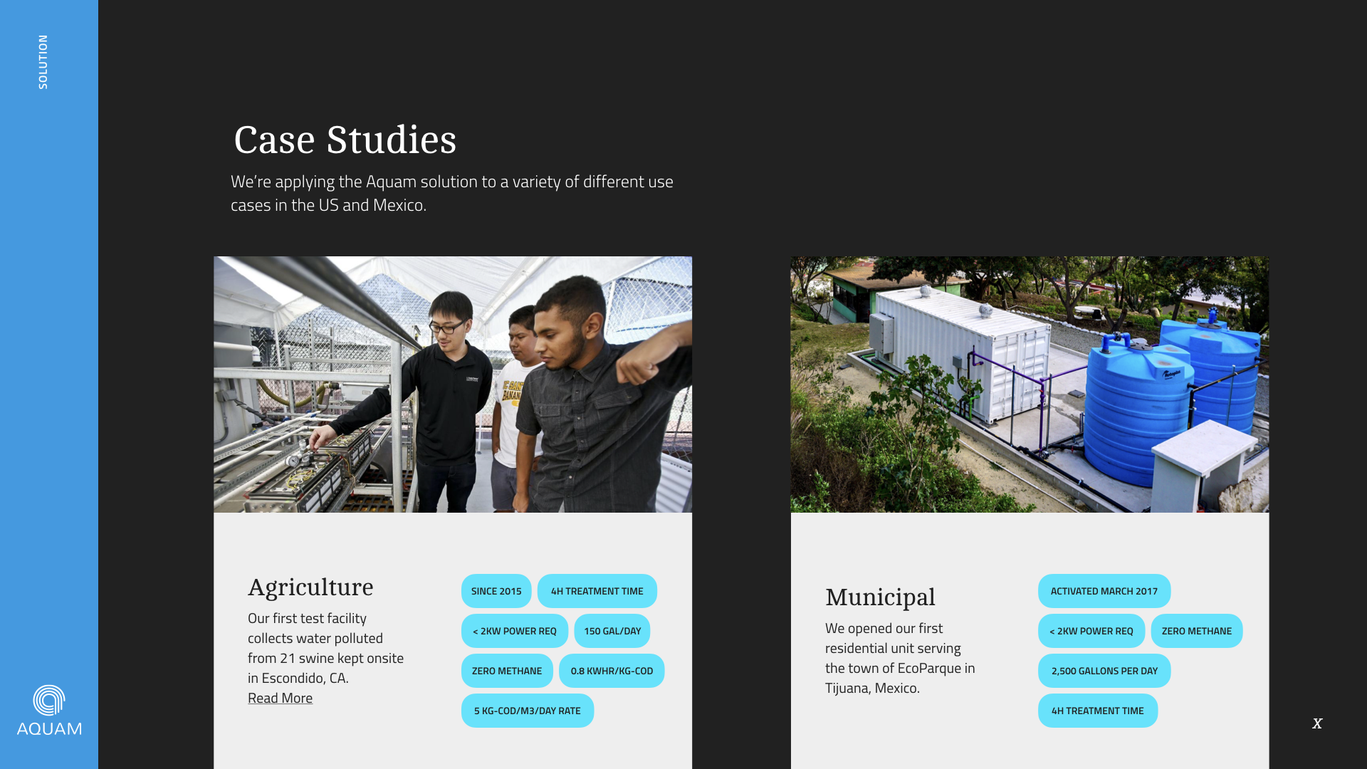
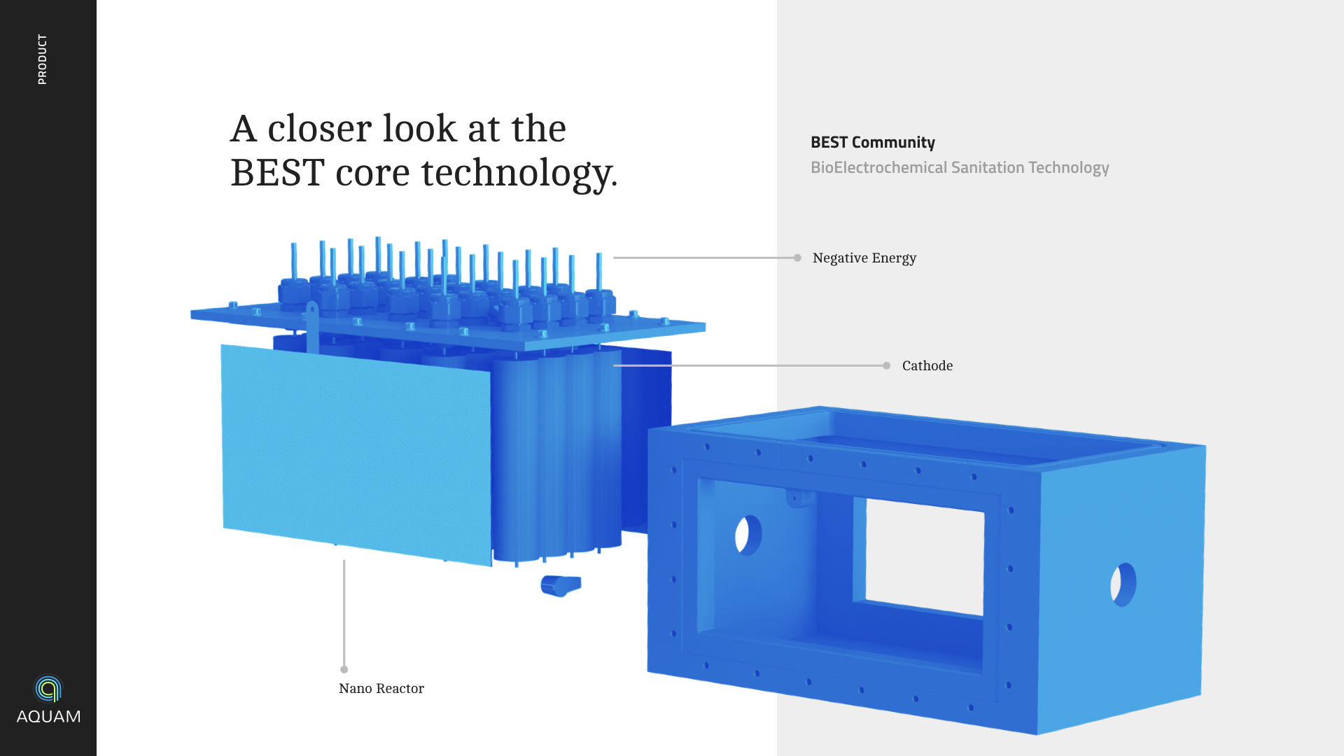
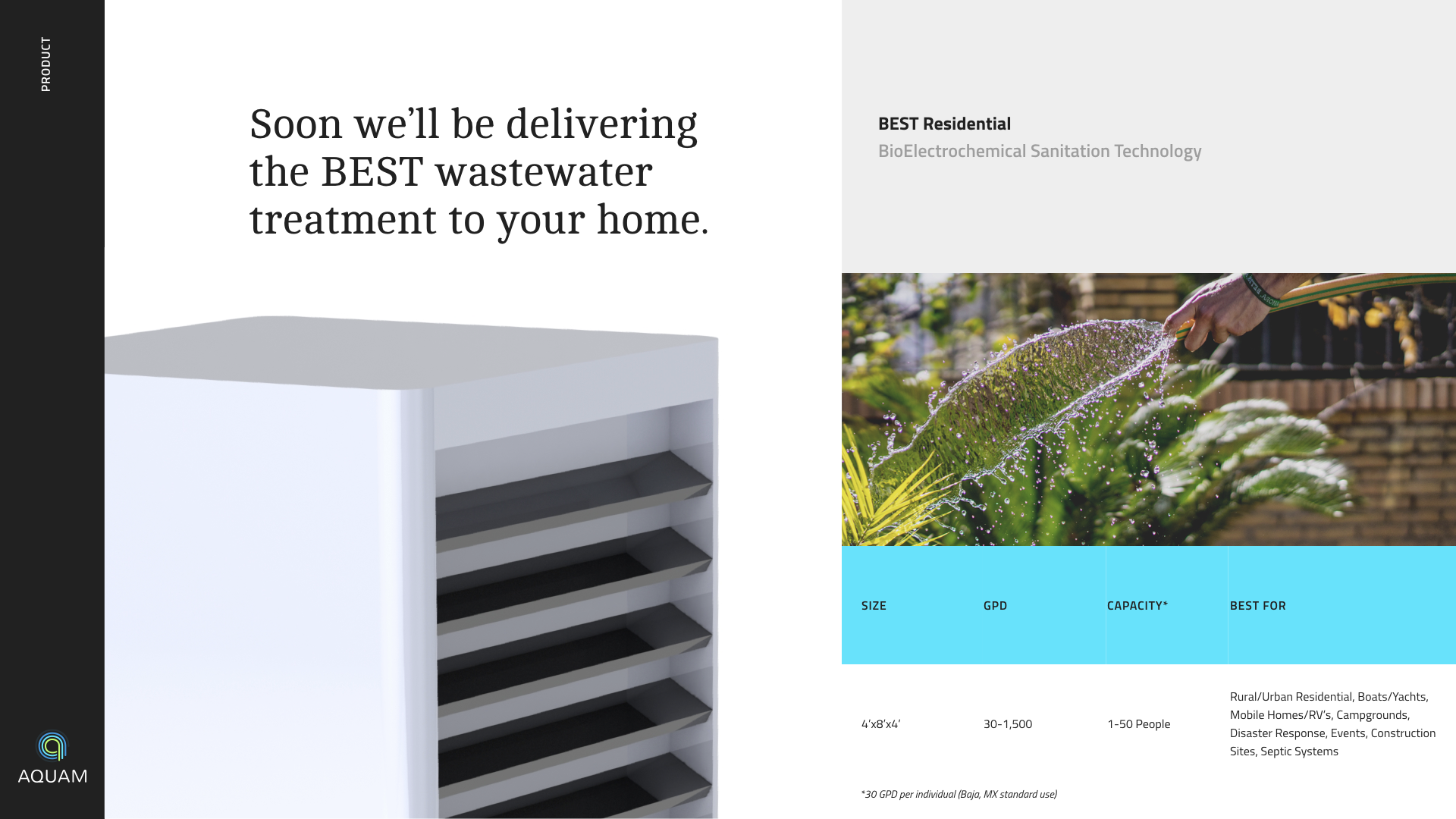
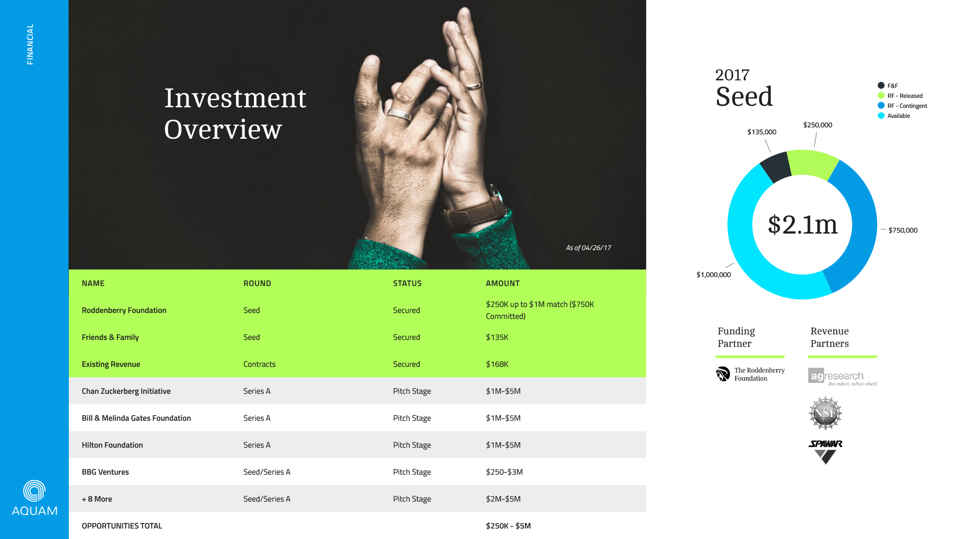
Beyond the brand-expression was the most critical task of the project; telling the brand story in a way that made sense to investors but remained credible when judged by the scientific community. Following the proven investment template developed by Sequoia Capital, I drafted a 20-page wireframe pitch deck (non-visual) and collaborated with the Aquam team and board members to craft their story.
After agreeing on the messaging and flow of the deck, I began applying the brand styles established in the previous phase to presentation layouts in Keynote. The final deliverable consisted of a fully editable slide-deck with multiple page templates, working brand styles, and a custom master grid.
